Tableau is an easy-to-use, open source business intelligence tool. You can use it to collect, process and create useful insights from your data. Tableau Software is among many other business intelligence tools.
Tableau software has several products you can use, such as Tableau Online, Tableau Public, Tableau Server, Tableau Cloud, Tableau Desktop, and Tableau Prep.
In this data visualisation tutorial, we will use Tableau Public. This is the free version of Tableau Desktop. You only need to create a personal account where you can share your workbooks and dashboard with the public.
- How to connect to your data source
- How to create Tableau worksheets
- How to create a Tableau dashboard
- How to add filters to your dashboard
- How to save, publish and share your Tableau dashboard
- FAQs
- How do I share Tableau dashboards with non-Tableau users?
- How do I give others access to edit my Tableau dashboards?
- Can I embed my Tableau Public dashboard into a website?
- What are the limitations of Tableau Public?
- Conclusion
Download Tableau Public from their website.
How to connect to your data source
When you open a new Tableau Public file known as a book, a pop-up window prompts you to connect to a data source, as shown in the screenshot below.
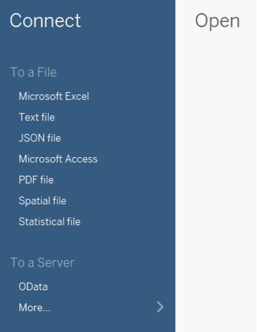
The main screen shows different options for connecting to a data source. However, some data source connections are not available by default. In such a case, download the servers, for example, MySQL.
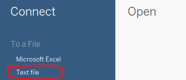
In our case, we downloaded a sales dataset sample for our analysis from Kaggle. Click on the “Text File” option to access the CSV data file.
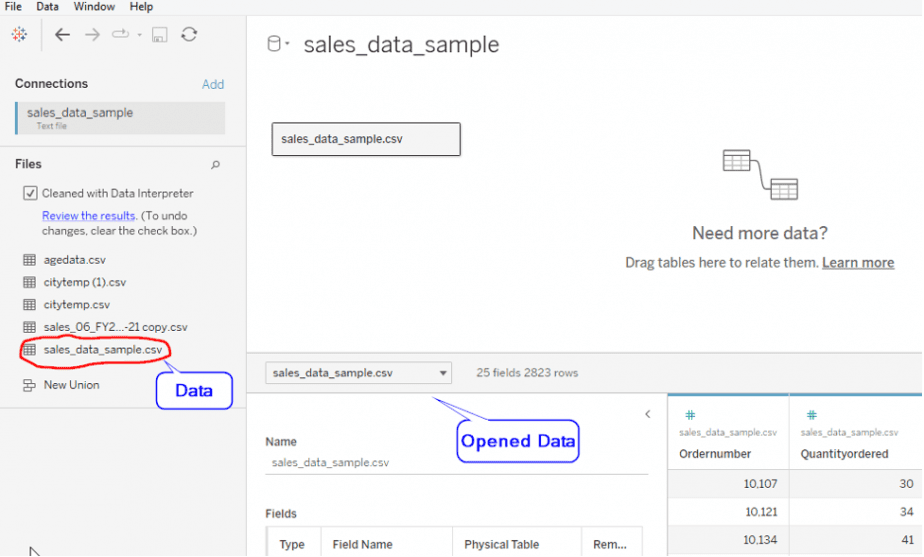
Select and open the CSV file from where you saved it in your computer.
The dataset is now loaded for you to explore and verify that it’s well structured before visualization. For instance, check for any null or outlier values.
How to create Tableau worksheets
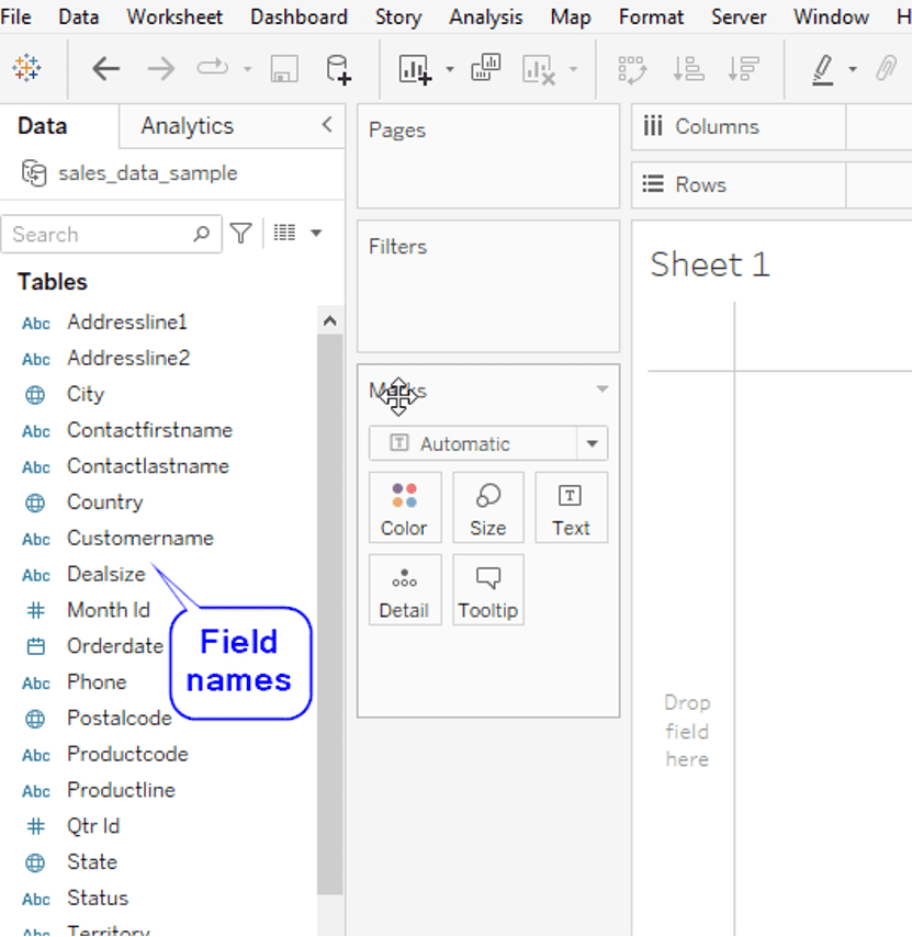
Click on the “Sheet 1” button at the bottom left to create your workbook.

A new canvas worksheet opens up. On the left side, you’ll see different data field names displayed in the “Tables” section.
Now, we are ready to start analyzing our data. Our sales analysis will help us achieve the following insights from the data:
- Revenue for all the years
- Total sales per city
- Total sales for each product line sold
For the visualization, we will use bar charts and a symbol map. Bar charts are ideal for comparing data categories. Maps are effective for displaying geographical and spatial dimensions.
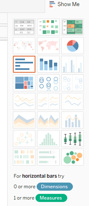
Tableau has many visualization charts you can use depending on your analysis. Find them displayed on the right side of the worksheet under the “Show Me” icon.
Tableau will also give you suggestions for the type of chart to use based on your data type.
To create a bar chart showing the total sales for all the years, drag the Year ID into the columns section and the Sales measure into the rows column.
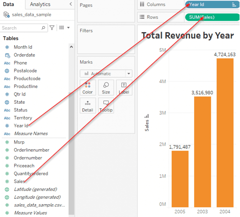
You can edit the bar chart as per your personal preferences. For instance, we sorted the revenue by ascending order, showing that 2004 had the highest revenue.
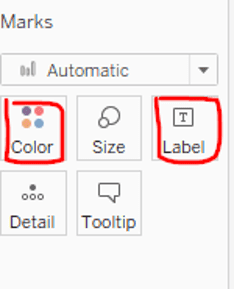
You can also change the bar colors and show labels.
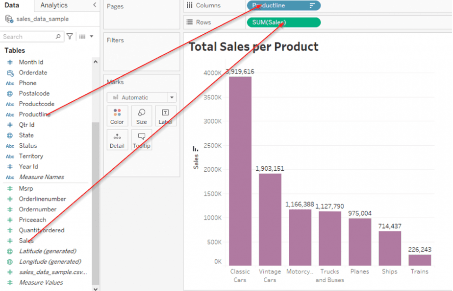
For the second bar chart that shows the type of products sold and their total sales, drag the Productline into the columns section and the Sales measure into the rows section.
The last worksheet is the map showing the Sales per City.
Sales are in the rows column while the columns section shows the City.
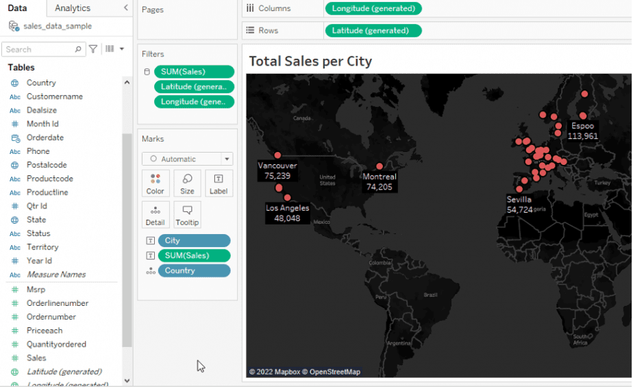
We will now use the three worksheets to create our dashboard.
How to create a Tableau dashboard
Multiple Tableau worksheets are combined to make up the dashboard.
Click on the “New dashboard” icon at the bottom left to create a dashboard.

The dashboard window contains a panel on the left side which shows the following:
- The canvas section allows you to set your preferred dashboard dimensions as per the device used (tablet, mobile, desktop).
- Sheets display all the worksheets you will add or remove in your dashboard.
- Objects contain items you can add to your dashboard like text, images, downloads, webpages, etc.

The right side of the window is the blank canvas for creating the dashboard. Drag and drop the sheets here to build your dashboard.
Depending on the number of sheets you have, you can adjust the canvas size dimensions to accommodate all the sheets. Use the “Size” button.
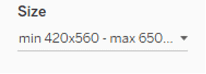
In our case, the three worksheets fit perfectly. Here is what the final dashboard looks like.
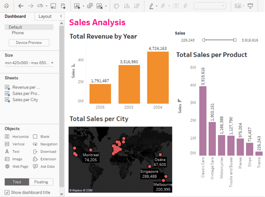
In the dashboard window, there are other features you can use when creating your report.
- Tiled layout
The tiled layout allows each worksheet to be fully visible in its tile. As you drag and drop the worksheets, a gray rectangle (tile) appears. Fit each worksheet within its own rectangle.
We have used the tiled option for our dashboard.
- Floating layout
Floating layout allows worksheets to overlap as there is no exclusive area for each worksheet. You can adjust the position, height and width of your worksheets.
- Show dashboard title
Click on this to display your dashboard title.

The text box appears on top of the worksheets. Edit the title as per your preference. We have used a pink font color, font size 20 and font type Tableau Semibold for our dashboard title.

How to add filters to your dashboard
To customize and limit data displayed on your dashboard, use filters. For example, if you only want to display the revenue for a specific year or city, you can do this by using the year or city as a filter.
In our comparative analysis, we have used sales as the filter. Sales is a related data field in all three worksheets.
To add a filter,
- Click on a worksheet and select the drop-down arrow on the top-right.
- Select filters then the field name.
- The filter will appear in the top-right of the dashboard.
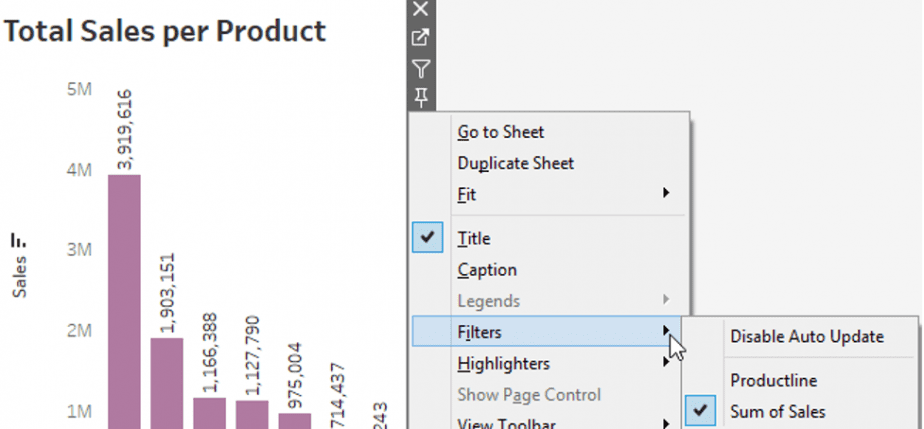
To connect this filter to all worksheets,
- Click on the drop-down arrow and select the “Apply to worksheets” option.
- Select the “All Using This Data Source” option.
- The filter is then automatically applied to all worksheets.

How to save, publish and share your Tableau dashboard
- Click on File > Save to Tableau Public.
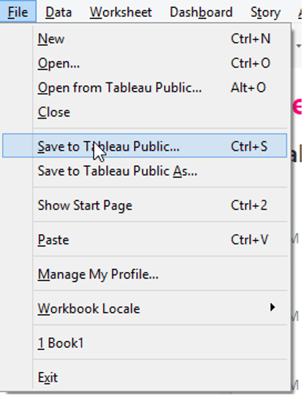
- A pop-up window appears that prompts you to name and save your workbook.
- The workbook will be uploaded to the public server.
- A pop-up window redirects you to your Tableau Public account. Once you log into your account, you will be able to view your dashboard.
With Tableau Public, you can share your dashboards with the public. However, they can only view but not edit them.
FAQs
How do I share Tableau dashboards with non-Tableau users?
Use Tableau Online. It allows you to publish your workbooks and dashboards online. Viewers can then access them like a webpage. However, only authorized users can interact with your dashboards.
How do I give others access to edit my Tableau dashboards?
Tableau Public has no provisions for other users to edit the dashboards you have shared. However, Tableau Online and Tableau Server give you access to web edit rights.
Web edit rights allow you to collaborate with other authorized users to make changes and engage with your dashboards.
Can I embed my Tableau Public dashboard into a website?
Yes. Open your Tableau Public account profile page where the dashboard is.
On the top right, click on the “Share” icon.

A pop-up window will come up, displaying a link for your work.
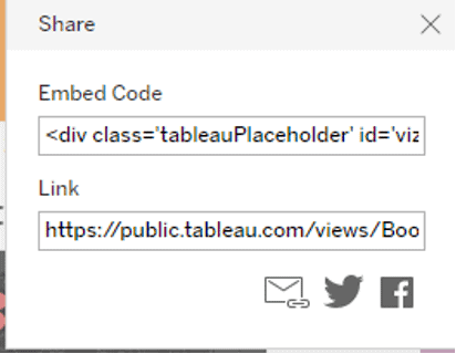
Copy-paste the link to the website.
What are the limitations of Tableau Public?
- You cannot save your worksheets and dashboards locally on your desktop.
- Lack of security for your work. Anyone can access your dashboards on the internet.
- Data limit of 10 million rows for a single connection.
Conclusion
Tableau Public is an easy-to-use and free-to-access business intelligence tool. We have learned how to create a simple Tableau dashboard from scratch. However, it doesn’t stop here. Use your creative side to create visually appealing worksheets and dashboards.
Related posts
Data Analysis and Visualisation using Microsoft Excel for Windows

