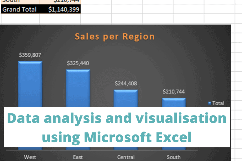
Microsoft Excel is a spreadsheet software usable in Windows, macOS, iOS, and Android. You can use it to create, edit, view, share, and manage workbooks, tables, spreadsheets, and dashboards containing your data.
Our tutorial focuses on simple techniques you can use to analyze and visualize data using Excel for Windows, version 2013.
Here is the Google Spreadsheet link for the data we’ve used.
- How to approach a data analysis project in Excel
- Examples of data analysis problems to solve in Excel
- Exploratory data analysis (EDA)
- Sales analysis using Excel formulas
- Sales analysis using pivot tables and charts
- How to create beginner level Excel dashboards
- How to calculate descriptive statistics in Excel
- Final thoughts on using Excel for data analysis and visualisation
How to approach a data analysis project in Excel
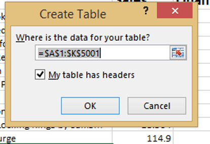
Before starting your data analysis, convert your raw Excel data into a table format. A table eliminates the need for you to remember which cells contain your data.
To create a table,
- Select any cell in the spreadsheet containing the data.
- Use the keyboard shortcut CTRL + T for Windows.
- Alternatively, go to Insert > Table.
- Click “OK” in the pop-up window.
To name your table,
- Go to Table Tools > Design > Table Name.
We have named our table Sales.
Now we are ready to analyze our data.
Examples of data analysis problems to solve in Excel
Exploratory data analysis (EDA)
Exploratory data analysis involves an in-depth investigation of your data to identify anomalies like missing values, discover trends, or draw summaries from columns.
After performing an EDA, you can now use your data to create final reports and visualizations.
We’ll use Conditional Formatting (CF) for the EDA.
Conditional Formatting in Excel allows you to make trends in your data more visible by creating rules that determine how the cells will be formatted and highlighted. For example, you can highlight all odd numbers from the highest to the smallest.
We’ll copy and paste our data into another spreadsheet before the conditional formatting to retain the original data for future use.
Examples of conditional formatting:
Which products had more than 10 quantities Sold?
Select the “Quantity” column.
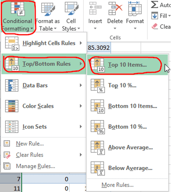
Go to Home > Conditional Formatting > Top/Bottom Rules > Top 10 Items.
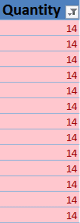
To view the highest number of products sold, apply the “Filter by colour” option to display the items. Our data has 13 products sold 14 times each.
How many products are sold above the average price?
Select the “Quantity” column.
Go to Home > Conditional Formatting > Top/Bottom Rules > Above Average.
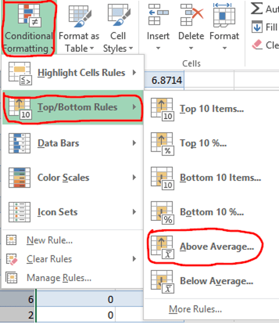
Filter by colour to see all the above-average products.
In our data of 5000 rows, 4993 products are above the average price. Here is a snapshot of a few cells filtered by color.

Are there products with duplicate sales?
To identify duplicate sales values,
Select the “Sales” column.
Go to Home > Conditional Formatting > Highlight Cells Rules > Duplicate Values.
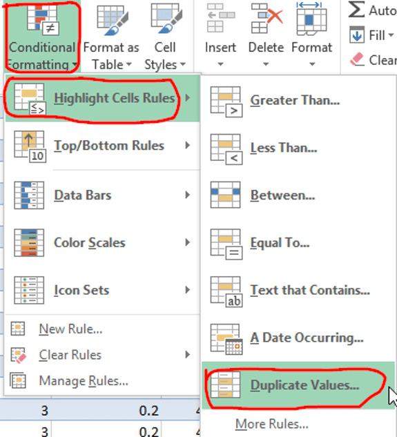
You can then sort the duplicate values. We have sorted ours from highest to lowest.
From the 5000 entries, 2238 had duplicated sales values.

Sales analysis using Excel formulas
Our sales analysis will help us identify the top/bottom performing city.
To list the number of cities,
- Select the “Cities” column.
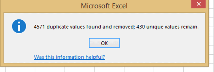
- Go to Home > Data > Remove Duplicates.
Our dataset remains with 430 distinct city names.
If you have Excel 365, you can use the UNIQUE function to extract the city names without duplicates.
Once we have all the cities, we will use the SUMIFS formula to find the following:
- Total sales per city
- Total quantities per city
The total sales per city output are

The SUMIFS formula has the following criteria
- Sum_range is the table name where your data is. Ours is the Sales table
- Criteria_range 1 is the sales column
- Criteria 1. Insert the table name again.
- Criteria_range 2 is the city column
- Criteria 2 is the city name
Press “Enter” and the total sales for the first city will appear.
Auto-fill the formula in the remaining “City” columns.
To auto-fill the formula,
- Select the first cell with the sales value.
- Hover the mouse until a black cross appears.
- Double-click on the black cross until the values will appear. Here is a snapshot of the first few cities.
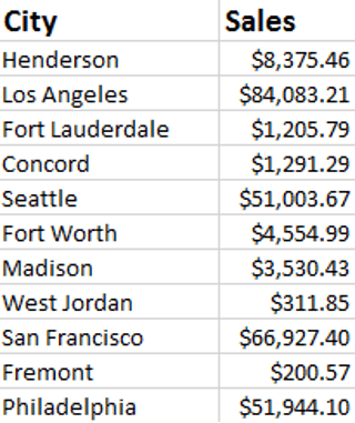
Apply the currency and decimal formatting using the shortcut CTRL + SHIFT + 4.
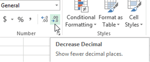
However, you can omit the decimals. To remove decimals, go to Home > General > Decrease Decimal.
The total quantity per city is:

Sort the results for a more visible look. We can sort the total sales from the highest to the smallest.
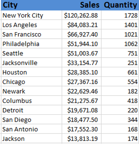
Of the 430 cities, New York City has the highest sales and quantities of products.
Sales analysis using pivot tables and charts
A pivot table allows you to organize, summarize, sort, and extract individual sections of a larger dataset. You can also create charts that show patterns and comparisons.
To create a pivot table in Excel,
- Go to Insert > Pivot Table.
- A pop-up window will prompt you to select your data source. We will use our Sales table.
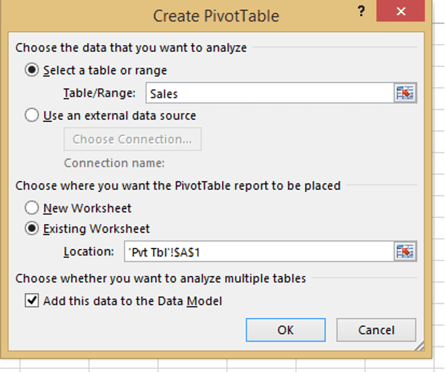
The pivot table appears, either on a new worksheet or the existing one. It displays the columns on your table on the right side and the table on the left.
We can use the pivot table to identify the total quantities sold per region.
- Use “Region” and “Quantities” as the fields.
- Drag the region field to the rows section that lists all the regions and the quantity field in the values section (this gives the total sum).
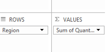
The pivot table automatically appears on the left side with the totals. By default, the row labels showing the regions appear in alphabetical order.
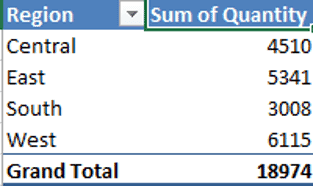
That’s not all. You can change the table’s design, sort the results, edit the headers, adjust the columns if they are not wide enough, format the numbers, and apply Conditional Formatting.
Let’s apply some of these changes and see the final output.
To sort the numbers,
- Select any cell with the quantity figures and right-click.
- Go to Sort > Sort Largest to Smallest.
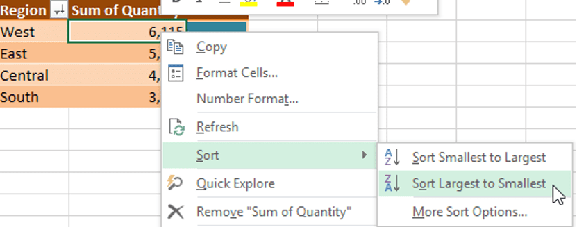
To format the numbers,
- Right-click on any cell with the quantities.
- Go to Number Format.
- A pop-up window appears with numerous options.
We have formatted using the number option with no decimals.
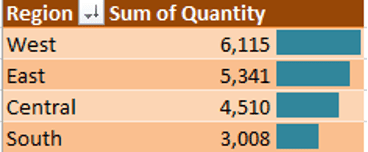
Out of the four regions, “West” has the highest quantity of products sold.
How to create beginner level Excel dashboards
Besides being an effective analytic tool, Excel has data visualization features you can use for your reports.
Excel dashboards range from simple to advanced.
Here is how you can start creating a basic Excel dashboard.
We have used Pivot Tables and column bar charts to summarize the following:
- Total sales per the first 20 cities
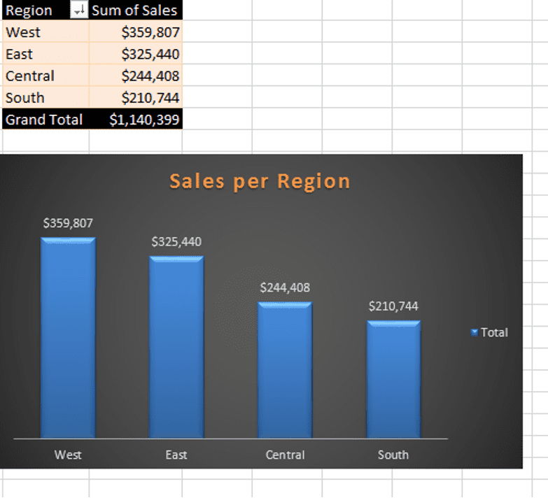
- Total sales per region
- Total sales per category.
Below are the screenshots before we combine them into the dashboard.
Total Sales of the First 20 Cities
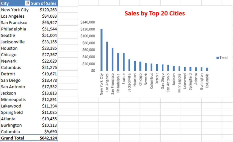
To display the top 20 cities only,
- Click on the drop-down arrow on the City column.
- Go to Value Filters > Top 10.
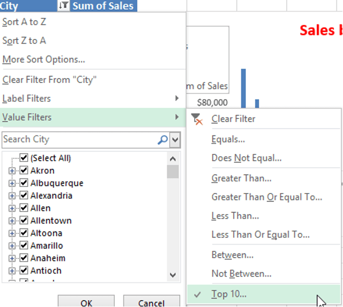
A pop-up window will appear, prompting you to fill in the number of items you want to be displayed.

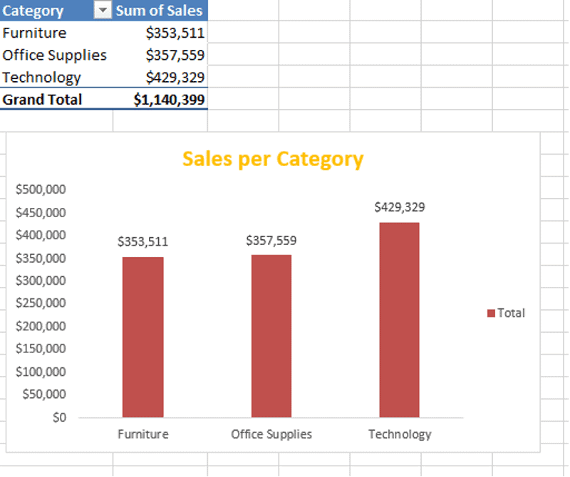
The products fall into three categories – furniture, office supplies, and technology.
Here is a snapshot of the final dashboard:
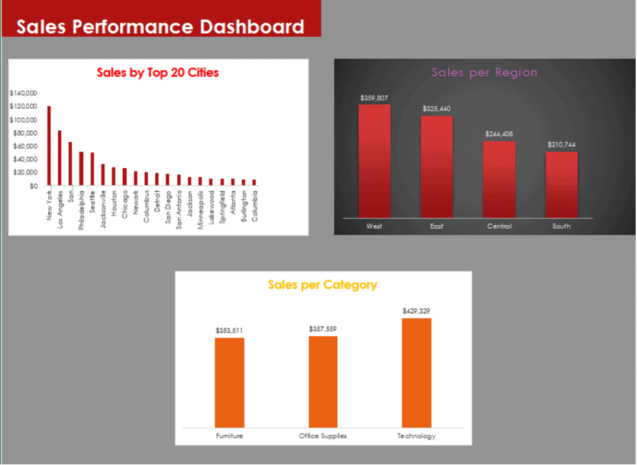
Creating more advanced and interactive Excel dashboards needs another tutorial altogether. However, you can try creating a simple one like the one above.
How to calculate descriptive statistics in Excel
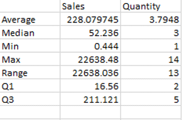
Our dataset contains number columns like sales, discount, profit, and quantity. We can use these for some quick statistics.
Excel has inbuilt formulas we can use. Some basic statistics we can calculate using the sales and quantity columns include:
- Average
- Median
- Minimum
- Maximum
- Range
- 1st and 3rd quartiles
Final thoughts on using Excel for data analysis and visualisation
Excel is an essential spreadsheet software designed to simplify your everyday data input. Excel is also an efficient data analysis, organization and visualization tool. We can hardly exhaust all its features in a single article. Use the above examples to kickstart your data analysis and visualization journey.
Related post
How to Code a Questionnaire in Microsoft Excel (A Practical Guide)

