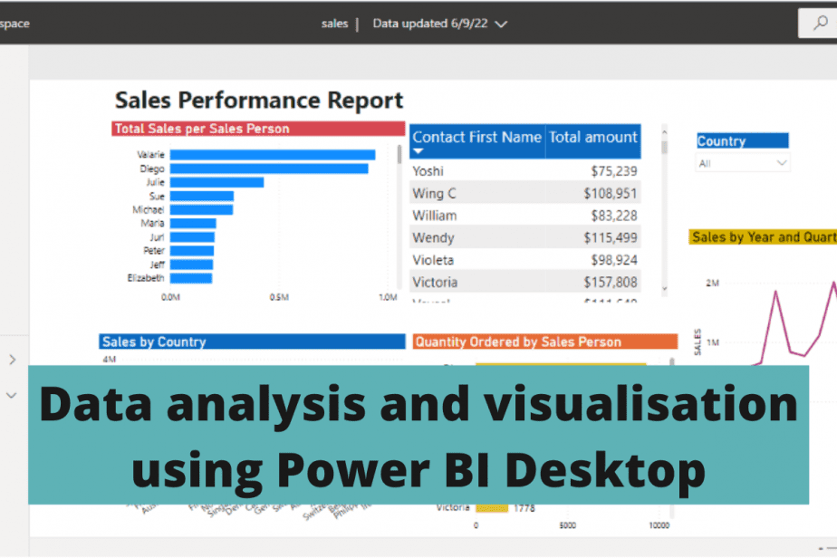
Power BI Desktop is a free version of Microsoft’s Power BI software. It is available for download and local installation on your laptop or personal computer from the website.
As a business intelligence tool, it allows you to connect to data, transform/clean data, build visualisation reports, and derive meaningful insights from your data.
- How to load data into Power BI
- Examples of data analysis reports
- How to use Power BI DAX language to build measures and calculations
- How to add measures
- How to add slicers
- How to format Power BI visuals
- Trend analysis and forecasting using Power BI
- How to do a trend analysis per year
- How to forecast
- How to save and publish Power BI dashboards
- How to update and refresh datasets
- Pros and cons of Power BI Desktop
- Final thoughts on data analysis and visualisation using Power BI Desktop
How to load data into Power BI
Use the “Get Data” button available from multiple sections, as shown in these screenshots.


Power BI allows you to add data from numerous sources. We will be using data from a CSV file.
- Go to Get data > Text/CSV
- Locate your data file and click on Load.

After a few minutes of loading, your data appears.

Use the Data view mode on the left side panel to explore your data before building your reports.
Examples of data analysis reports
We will create a sales performance report with the following insights:
What are the total sales per country?
We will use a column chart to display the total sales per country.
- Select the column chart on the “Visualizations” panel.
- Drag and drop “Country” on the “Axis” section and “Sales” on the “Values” section.

Our data has 19 countries, with the USA having the highest sales.

What are the total sales for each sales contact person?
Let’s use a bar chart for this. The sales contact people have their first and last names on the field lists. We will use their first names for the bar chart.
- Drag and drop the “Contact first name” on the “Axis” section and “Sales” on the “Values” section.

Our data has 10 salespeople, with Valerie having the highest sales.
How to use Power BI DAX language to build measures and calculations
DAX (Data Analysis Expressions) is a programming language containing a library of functions and operators for creating customized tables, calculated fields, and measures.
Besides presenting the total sales per sales person in a bar chart, we can use a table with DAX calculations.
In the bar chart, we dragged and dropped the sales amount in the values section, and Power BI calculated it automatically. DAX allows you to specify how you want the values to appear.
How to add measures
- Select a table from the “Visualizations” panel.
- Drag and drop the sales “Contact first name” field on the “Values” section.

- Right-click on the Sales amount and select “New Measure”.

Alternatively, click the “New measure” button in the “Home” tab.
A text box appears where you can create the new measure.
Our new measure will be the total amount of sales as shown.

New measures have both logic and visual aspects to them. Use the “Measure tools” button to edit the visual effect of the new field by adding the currency symbol with no decimal point.

Click the “tick” mark on the left to add the new measure to the fields panel.
New measures are denoted with a “calculator” symbol, as shown below, so you can easily spot them.

When we drag and drop the total amount below the sales contact’s first name, all the salespeople and their total amounts are displayed. Here is a snapshot of a few.
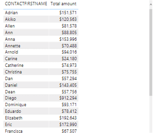
We can then add filters and slicers to our salespeople’s table. For instance, we can filter the salespeople per country.
How to add slicers
- Select the “slicer” from the visualization panel.
- Add the “Country” field on the slicer.

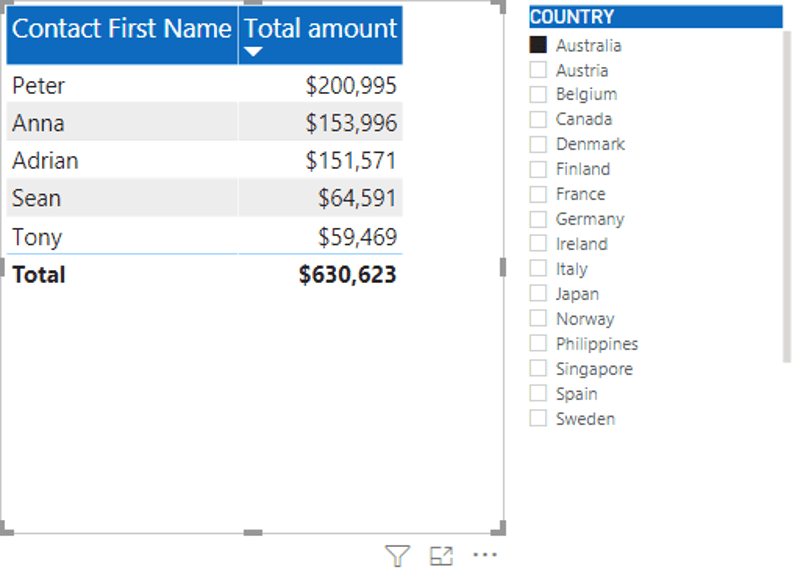
Click on any country in the slicer to view the salespeople and their total amounts in that country. For example, Finland has three salespeople with a total sales amount of $ 329,582.

How to format Power BI visuals
Rather than leaving our reports looking bland, we can format and adjust their appearance. For example, we can format the table displaying the salespeople and the total amount.
- Select the table.
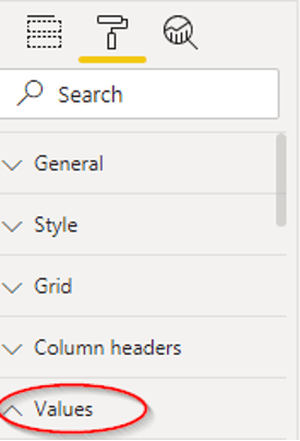
- Click on the “Format” icon shown as a paintbrush.

We’ll increase the value font size from 10 to 16.
- Go to Values > Text size.
We’ll also increase the row padding to make the table rows larger and easier to read.
- Go to Grid > Row padding.
We’ve increased the padding from 1 to 3.

Lastly, we’ll enlarge the header, add a font color as well as a background color.
- Go to Column headers > Font color from black to white.
- Column headers > Background color to blue.
- Column headers > Text size of 18.
Our table now looks much better. We can sort the total amount from the highest to the lowest.
It may be hard to locate all the formatting features as you build reports. The search bar comes in handy.

We can make the table and slicer more interactive by adding another bar chart showing the quantity ordered by each salesperson.
When you click on any country in the slicer, the table and the bar chart display the salespeople’s total amounts and quantity of products ordered. For example, here is a snapshot of Germany.

Trend analysis and forecasting using Power BI
Trend analysis and forecasting are applicable if your data has dates or time elements. Our data has order dates, months and years that we can use to forecast sales and show the sales trends.
Trendsand forecasts compare and predict future movements of metrics you want to analyze. These could be sales, trade volume, stock price, customer segmentation, etc.
How to do a trend analysis per year
- Select the line chart from the visualization panel.
- Drag and drop the “Order date” on the axis field and the “Sales” on the values.
Power BI automatically builds a date hierarchy of the order date by listing the year, quarter, month, and day.
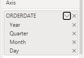
The line chart shows a sharp decline in sales from 2004 to 2005.

Use the “pinch fork” icon at the top to change the order dates, for example, by year or day.

For example, let’s see the sales trend by year and quarter.

Use the drill-up and drill-down arrows to add and remove the order dates.

How to forecast
Your line chart must have a single series line like the line chart above to forecast. The Y-axis has to have a single field, not multiple.
To forecast,
- Click on the “Analytics” icon.

- Go to “Forecast”.
- Click the “Add” button to input the forecast length and duration type. Let’s forecast the sales trend for the next six months.

- Click on the drop-down arrow after the forecast length to specify the duration. For example, the period can be years, months, or days. Let’s use months for our example.

Our sales chart now displays the forecast as highlighted in red below.

Caution when using Power BI’s Forecasting features is that it’s purely based on statistical techniques and may not be helpful for real-world business cases.
How to save and publish Power BI dashboards
Before saving our reports, we’ll format the pages by adding titles and positioning the graphs well.
Here’s the final dashboard.

Use the “Publish” option at the top-right to share your reports with others in Power BI’s cloud service.
You must have an online Power BI account that you log into using a business, student or work email, not a personal email.
Once you log in, your reports appear online. Here is the online view.
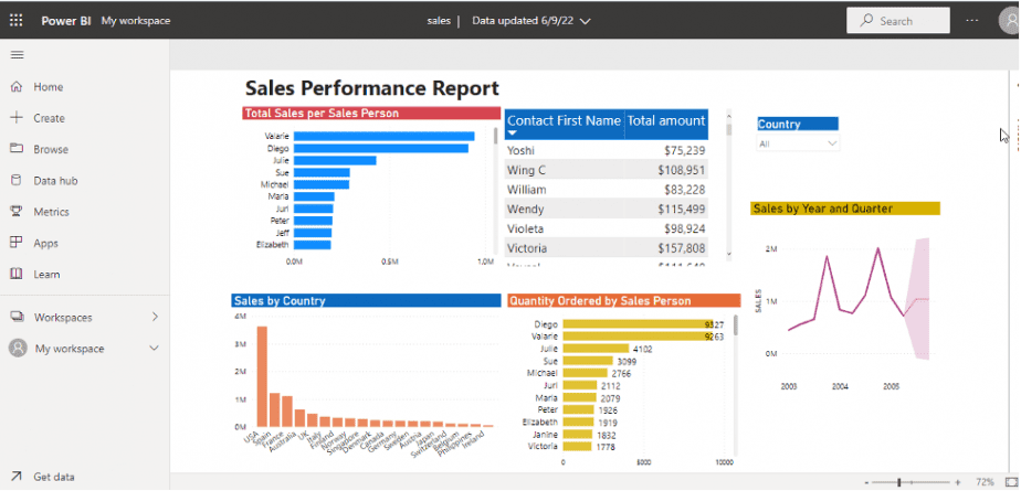
Power BI has a two-tier system for data and reports management:
- As the account owner, you can interact and edit the reports anytime.
- Consumers and other users can only view, read and interact with the dashboards.
How to update and refresh datasets
Once in a while, you may need to update your datasets by adding new data, editing existing data, or changing data formatting. What happens to the reports you’ve already published? With Power BI, you can refresh the data, and your pages will automatically become updated.
- Use the “Refresh” button to update your data. Power BI will then recalculate all the totals, measures, and formulas you used in your reports, and the new values will appear.
- Click the “Publish” button to update already published reports.
- Save and replace the existing dataset.
- Refresh your browser window to view the updated reports.
Pros and cons of Power BI Desktop
Power BI is one among many business intelligence software. There are advantages and disadvantages when using any software. Here are a few for Power BI.
Pros
- Power BI Desktop is free to use. Its paid version (Power BI cloud service) is pocket-friendly. The monthly subscription starts at $ 9.99 per user.
- It allows data connectivity from a wide range of data sources.
- Power BI and Excel have integrated tools. For example, pivot tables, power query, slicers, tables, and charts. Anyone with basic Excel skills can figure out Power BI quickly.
- Power BI has monthly updates that come with more efficient features. These frequent updates come from suggestions and recommendations from users.
Cons
- Power BI Desktop has limited data volume. To handle bigger datasets, you have to upgrade to the paid version.
- You must have a work or student email to publish reports online. If you are self-employed or a freelancer, you can incur unforeseen costs of paying for a domain email name just to publish your work with Power BI.
Final thoughts on data analysis and visualisation using Power BI Desktop
Whether you’re a data analyst or a business using business intelligence tools to retrieve and analyze data, Power BI allows you to interact with your data to create meaningful and visually appealing insights.
Related posts
Data Visualisation using Tableau Public
Data Analysis and Visualisation using Microsoft Excel for Windows

