In addition to using descriptive statistics for preliminary analysis, one can also use graphs. Unlike the statistics, graphs offer a visual way of exploring the data further. This post illustrates how to create and interpret six different types of graphs in SPSS using practical examples. Whereas there are different ways of generating graphs in SPSS, this post will focus on the Chart Builder.
The six graphs are: histograms, bar graphs, pie charts, line graphs, scatterplots and box plots.
- How to create a histogram in SPSS
- How to interpret a histogram
- How to create bar graphs in SPSS
- How to interpret a bar graph
- How to create line graphs in SPSS
- How to create pie charts in SPSS
- How to create scatterplots in SPSS
- How to create a matrix of scatterplots in SPSS
- How to create a box plot in SPSS
- How to edit a chart or graph in SPSS
- How to import SPSS graphs and charts into a Word processor
Before creating graphs in SPSS, it is important to correctly specify the level of measurement of each variable, that is, whether the variable is nominal, ordinal or scale. This is important because different types of graphs use different levels of measurement.
How to create a histogram in SPSS
A histogram is used to show the distribution of a single continuous variable.
To create a histogram in SPSS, follow the procedure below:
- Click on the Graphs menu > Chart Builder > click OK.
- From the chart builder dialogue box, click on the Gallery tab > Histogram > choose the first option (simple histogram).
- Hold down the simple histogram icon and drag it to the chart preview canvass.
- From the list of variables, select a continuous variable and drag and drop it into the X-axis box in the chart preview canvass.
- You can change the title, X-axis and Y-axis using the element properties tab on the right-hand pane.
- You can also change the appearance of the histogram using the chart appearance tab on the right-hand pane. For instance, you can change the colour of the graph in this tab.
- Additionally, you can specify how you want the missing values to be handled using the options tab on the right-hand pane.
- Click OK.
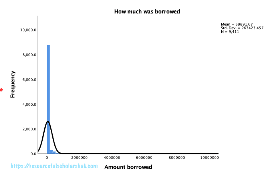
A sample histogram is shown in the image below:

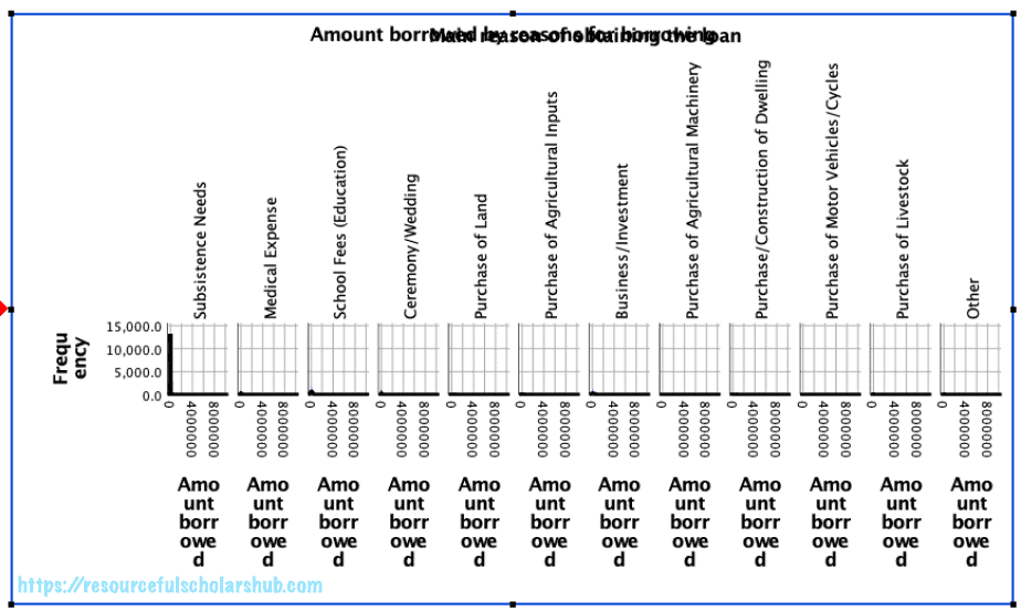
You can also create separate histograms for the same continuous variable but using a categorical variable.
In the example above, we may want separate histograms for the amount borrowed based on the reasons for borrowing.
The separate histograms can either be arranged horizontally, vertically, or stacked
To do that in SPSS:
- Repeat the above procedure.
- In the chart preview canvass, select the grouping variable and drop it in the panel box in the canvass.
- In the chart builder dialogue box, go to the Groups/Point ID tab and select either columns panel variable (to arrange them next to each other) or rows panel (to arrange them on top of each other).
- Click OK.
A sample grouped histogram is shown below, although they are small due to the large numbers of 0 in the dataset:

How to interpret a histogram
The histogram will give indications on the distribution of the data, that is, whether the data is normally distributed or skewed (either to the left or right).
How to create bar graphs in SPSS
Bar graphs are used to display categorical variables.
Bar graphs can be simple or complex depending on the variables you want to display.
To create a simple bar graph in SPSS using only one categorical variable:
- Click on Graphs menu > Chart Builder > OK.
- From the chart builder dialogue box, click on the Gallery tab > Bar > choose simple bar.
- Drag and drop the simple bar into the chart preview canvass.
- From the variables list, select the categorical variable of interest and drop it into the X-axis.
- Click OK.
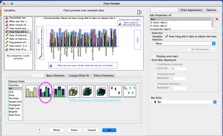
To create a clustered bar graph in SPSS using two categorical variables and one continuous variable:
- Click on Graphs menu > Chart Builder > OK.
- From the chart builder dialogue box, click on the Gallery tab > Bar > choose clustered bar.
- Drag and drop the clustered bar into the chart preview canvass.
- From the variables list, select the categorical variable of interest and drag and drop it into the X-axis section.
- Select the other categorical variable of interest and drag and drop it into the “cluster on X: set colour” section.
- Select the continuous variable of interest and drag and drop it into the Y-axis section.
- You can choose to display the error bars by clicking on the Element Properties tab and ticking the display error bars option.
- Click OK.
To create a stacked bar graph in SPSS using two categorical variables and a continuous variable:
- Click on Graphs menu > Chart Builder > OK.
- From the chart builder dialogue box, click on the Gallery tab > Bar > choose stacked bar.
- Drag and drop the stacked bar into the chart preview canvass.
- From the variables list, select the categorical variable of interest and drag and drop it into the X-axis section.
- Select the other categorical variable of interest and drag and drop it into the “cluster on X: set colour” section.
- Select the continuous variable of interest and drag and drop it into the Y-axis section.
- Click OK.
How to interpret a bar graph
The simple bar graph presents a quick summary of the differences in each category in a categorical variable.
The clustered/stacked bar graph shows differences in scores of a continuous variable for each of the categorical variables selected.
In the simple bar graph above, merchant/shop and self-help groups were the biggest sources of credit for the participants, followed by relatives/friends/neighbours and saccos.
In the clustered/stacked bar graphs above, obtaining government funds took the participants the longest time especially if the reason for the credit was business/investment.
Whereas the graphs give a visual presentation of the differences in categorical variables, further analyses of such differences should be conducted to ascertain the statistical significance of such differences. This can be done using the analysis of variance and other techniques depending on the nature of the variables.
How to create line graphs in SPSS
A line graph is used to present a continuous variable in different points in time. It is therefore perfect for time series data e.g annual gross domestic product in the last 20 years, quarterly financial performance of a company in the last 10 years, mean hourly temperatures in the last 7 days etc.
A line graph is also used to present the mean scores of a continuous variable across different categories of a categorical data e.g mean test scores across gender (male vs. female).
A line graph can be simple (using only one continuous variable) or complex (using one continuous variable and two or more categorical variables).
To create a multiple line graph in SPSS:
- Click on the Graphs menu > Chart Builder > OK.
- From the chart builder dialogue box, choose line.
- Click on the Gallery tab > multiple line, and drag and drop it into the chart preview canvass.
- From the variables list, select the continuous variable and drag and drop it into the Y-axis section.
- Select the first categorical variable and drag and drop it into the X-axis section.
- Select the second categorical variable and drag and drop it into the set colour section.
- Click OK.
How to create pie charts in SPSS
Pie charts are used to show the relative proportions of each category in categorical variables.
To create a pie chart in SPSS:
- Click on the Graphs menu > Chart Builder > OK.
- From the chart builder dialogue box, choose pie/polar.
- Click on the Gallery tab and select the pie chart. Drag and drop it into the chart preview canvass.
- From the variables list, select the categorical variable and move it to the “slices by” section.
- You can choose to display either the count or the percent by going to the Elements Properties tab and selecting from the angle variable drop down list. This will be shown on the Y-axis of the chart preview.
- Click OK.
How to create scatterplots in SPSS
Scatterplots are used to explore the correlation between two continuous variables.
Creating a scatterplot is an important step before conducting correlation analysis between two continuous variables.
A scatterplot helps to display the direction and strength of the correlation between the variables.
Direction of correlation means either positive or negative correlation.
In positive correlation, the two variables move in the same direction: an increase in one variable is associated with an increase in the second variable.
In negative correlation, the two variables move in opposite directions: an increase in one variable is associated with a decrease in the second variable.
A scatter plot can either be simple or grouped.
To create a simple scatterplot in SPSS:
- Click on the Graphs menu > Chart Builder > OK.
- From the chart builder dialogue box, choose scatter/dot.
- In the Gallery tab, select the simple scatter. There are two simple scatter options: one without fit line, the other with fit line.
- Select the first continuous variable and drag and drop it into the Y-axis section.
- Select the second continuous variable and drag and drop it into the X-axis.
- Click OK.
The images below show a scatterplot without a fit line.
The scatterplot without a fit line makes it difficult to tell if there is a correlation between the two variables and the direction of that correlation if it exists.
Including the fit line helps to overcome these challenges.
The images below show a scatterplot with two a fit line.
From the scatterplot above, it is clear that there is a positive correlation between the two variables: the length of time it takes to obtain a loan is positively correlated with the amount borrowed.
To create a grouped scatterplot, we include a categorical variable in the scatterplot.
- Click on the Graphs menu > Chart Builder > OK.
- From the chart builder dialogue box, choose scatter/dot.
- From the Gallery tab, choose grouped scatter.
- From the list of variables, select you first continuous variable and drag and drop it into the X-axis.
- Select your second continuous variable and drag and drop it into the Y-axis.
- Choose your categorical variable and drag and drop it into the “set colour” section.
- Click OK.
How to create a matrix of scatterplots in SPSS
If you have several scatterplots that you want to create, you can create them in a matrix instead of creating separate scatterplots.
To create a matrix of scatterplots in SPSS:
Click on Graphs menu > Chart Builder > OK.
From the chart builder dialogue box, choose scatter/dot > matrix. Drag and drop it in the chart preview canvass.
From the variables list, select the continuous variables of interest and drag and drop them into the scatter matrix section.
To maximise the use of data, you can choose the “exclude missing data variable-by-variable” in the Options tab on the right-hand pane.
Click OK.
How to create a box plot in SPSS
Box plots (also known as whisker plots) are also used to explore the distribution of scores on variables.
They provide detailed information about the distribution of variables and specifically about five key measures: minimum score, maximum score, first quartile, median, and third quartile.
They are therefore useful for examining the outliers in a variable.
Box plots have a box in the middle, a line in the middle of the box, and two lines (whiskers), one extending from the box downwards and the other one extending from the box upwards.
The end of the bottom whisker shows the minimum value while the end of the top whisker shows the maximum value.
The line in the middle of the box shows the median value.
The bottom half part of the box indicates the first quartile, while the top half part of the box indicates the third quartile.
If there outliers in the data, they will be shown by either circles or stars. The starts indicate the extreme outliers.
Next to the circles and stars and numbers. These numbers indicate the case ID of the outliers in the dataset. These help the researcher to identify where the outliers are located in the dataset so that they can easily be corrected.
To create a simple box plot in SPSS:
- Click on the Graphs menu > Chart Builder > OK.
- From the chart builder dialogue box, select box plot > simple box plot, then drag and drop it into the chart preview canvass.
- From the variables list, choose your continuous variable and drag and drop it into the Y-axis section.
- Choose your categorical variable and drag and drop it into the X-axis section.
- Click OK.
To create a clustered box plot in SPSS:
- Click on the Graphs menu > Chart Builder > OK.
- From the chart builder dialogue box, select box plot > cluster box plot, then drag and drop it into the chart preview canvass.
- From the variables list, choose your continuous variable and drag and drop it into the Y-axis section.
- Choose your categorical variable and drag and drop it into the X-axis section.
- Choose the second categorical variable and drag and drop it into the “cluster on X: set colour” section.
- Click OK.
How to edit a chart or graph in SPSS
Once you have created your graph, you may want to make some modifications to it, e.g change the wording in the title, change the font and font size, change the colour etc.
To edit a graph in SPSS:
- You need to be in the Output window of SPSS.
- Double click on the graph you want to edit. A new window – chart window – will open showing the graph and additional menu that you can use to edit the graph.
The types of edits you can make to a graph will depend on the type of graph you have. For instance, you cannot add a fit line to a piechart.
The edit options that are not applicable to the graph will be greyed out, while the applicable options will be blue in colour.
To know all the options you have, it is best to practice and experiment using different types of graphs and charts.
How to import SPSS graphs and charts into a Word processor
Once you have created and edited your graph and are satisfied with it, the next step is to import it into a Word processor of your choice e.g Microsoft Word.
- Open the Word document.
- Go to the SPSS Output window, click on the graph you want to copy then click the Edit menu and select copy.
- Go to the Word document, place the cursor where you want the graph to appear, click the Edit menu in Word and select paste.
- Save the changes in the Window document using the File menu.
In conclusion, this post has demonstrated how to create different types of graphs (histograms, bar graphs, pie charts, line graphs, scatterplots and box plots) in SPSS. It has also explained how to interpret the different types of graphs.
Related posts
SPSS Tutorial #7: Preliminary Analysis using Descriptive Statistics in SPSS


